Cigarette Branding in the 1960s
How Pack Design Became a Marketing Tool — Minimalism, Material Innovation, and the Mad Men Era
📦🚬 The 1960s marked a turning point in cigarette packaging. As health concerns began to surface and competition intensified, tobacco companies realized that the pack itself was a powerful marketing tool — an art object that could convey status, sophistication, and identity. This was the Mad Men era of advertising, where design agencies like Lippincott & Margulies and Landor Associates transformed the humble cigarette pack into a canvas for branding brilliance. This article explores how 1960s pack design evolved: from minimalist makeovers to plastic “humiflex” packs, from bold stripes to cultural symbolism.
✨ The Minimalist Revolution: Tareyton’s “Less Clutter” Strategy (1960)
• Herbert Tareyton’s monocle-and-top-hat logo was removed
• New package featured a “horizontal deep blue stripe”
• Red vertical stripes were used for the dual-filter brand
• Goal: “Less clutter will mean more sales”
In 1960, the American Tobacco Company hired Lippincott & Margulies — an industrial design firm — to redesign the Herbert Tareyton king-size package. The old pack featured a dapper gentleman with a monocle and top hat. The new design removed the character entirely, replacing him with a “horizontal deep blue stripe” across the face of the pack .
- 📋 The rationale: Less clutter would mean more sales. The design firm surveyed consumers on which pack they would buy and what the package “told them” .
- 🔴 Brand differentiation: The Tareyton dual filter brand (introduced in 1958) had two bold red vertical stripes. The new king-size pack’s horizontal blue stripe created a clear visual distinction while still linking the two products under the Tareyton umbrella .
- 📈 The result: Sales of the dual filter brand doubled between 1958 and 1960, in part due to the redesigned packaging and increased popularity of filter brands .
- 🎯 The “aristocratic” image: Despite removing Herbert Tareyton’s portrait, the new design was chosen to “retain the loyalty and confidence of regular Herbert Tareyton users” and “do nothing to damage the somewhat aristocratic image” the brand had built .
📖 From The New York Times (May 6, 1960): “The new package was prepared by Lippincott & Margulies, industrial designer. It previously had redesigned the Tareyton dual filter cigarette package, again making it appear less cluttered.”
📦 The Plastic Revolution: Paxton’s “Humiflex” Pack (1964)
• Philip Morris released plastic boxes for Paxton-brand cigarettes
• Designed by Walter Landor (founder of Landor Associates)
• Green for menthol, featuring the Philip Morris crest
• Kept cigarettes “fresher” — a first for North American cigarettes
In 1964, Philip Morris (now Altria Inc.) took a bold step: plastic packaging. While European companies had experimented with plastics, American companies had not yet made the leap. Philip Morris hired Walter Landor — founder of Landor Associates — for the design, and DeBell & Richardson to formulate the plastic material, called “humiflex” .
- 🧪 The innovation: Plastic packaging kept cigarettes “fresher” — a selling point in an era when freshness was a concern for smokers .
- 🎨 The design: Landor focused on the Philip Morris crest for the body. Because Paxton was a menthol brand, green was used for the top and bottom of the package .
- 🔒 Secrecy: Philip Morris kept the entire process secret “from start to finish” with no public testing. “They destroyed any unused samples of the plastic” .
- 📉 The legacy: Paxton was intended to be “revolutionary in terms of both style and materials” — a rare example of innovation in packaging during the Mad Men era .
📖 From the Smithsonian National Museum of American History: “Philip Morris released its new humiflex packaging, which used plastic boxes to keep cigarettes fresher.”
🎯 The Status Pack: Palladino’s Perfectos and the Luxury Appeal (1965)
• Designed by Tony Palladino
• Strikingly different from typical 1960s tobacco ads
• No mention of taste — only exclusivity and status
• Faux-leather finish on the pack
Not all 1960s pack design was about simplicity. Some brands embraced luxury. Designer Tony Palladino created a series of Perfectos ads in 1965 that were “strikingly different in style from the typical tobacco ads of the 1960s” .
- 💎 The appeal: Palladino’s designs “make no mention of the product’s taste, instead appealing directly to the (clearly male) status-conscious smoker” .
- 🧵 Faux leather: The pack featured a “faux-leather finish” — a tactile signal of luxury .
- 🚬 The open pack motif: The ad featured “the open pack” — a popular image in 1960s tobacco advertising. One design “brings to mind a particularly deadly order of french fries,” with staggered cigarettes looking “like actual smokestacks” .
- 📉 The timing: Since mandatory health warnings were “shortly down the road,” the association between cigarettes and smokestacks was “probably not an association tobacco companies later wished to encourage” .
📖 From the SVA Archives: “These Perfectos cigarette ads, designed by Tony Palladino in 1965, caught my attention because they’re so markedly different in style from the typical tobacco ads of the 1960s.”
🌍 Global Influence: Cigarette Packs as Cultural Artefacts
• In communist countries: pack designs celebrated political events
• In the West: minimalist, high-gloss, aspirational
• Tourism became a theme for special editions
• China: mythological and religious imagery dominated
While Western pack design embraced minimalism and luxury, the rest of the world was using cigarette packs for different purposes — as political propaganda, souvenirs, and cultural artefacts .
- 🇨🇳 China: Many special series carried “images of Buddhist and Taoist deities” — “very colourful” and “naturalistic” — contrasting sharply with the abstract packaging popular in Europe and the US .
- 🇦🇱 Albania: In the 1960s and 1970s, packs were “made exclusively to commemorate important political events” — labour party congresses, anniversaries of revolutions, national holidays .
- 🌍 Tourism: “Whether Argentina, Brazil, Australia or Cambodia,” packs were designed as “an incentive to travel and also as a souvenir” .
- 📉 The medium’s potential: As one source notes, “because of the increasing restrictions on tobacco, the cigarette pack has grown in significance as an advertising medium — in all countries of the world” .
🎨 Japanese Modernism: Hi-lite’s Minimalist Breakthrough (1960s)
• Designed by Makoto Wada
• Bold sky blue contrasted against white
• Slanted script logo for “soft” feeling
• Minimalist — no complex decoration, clean white space
In Japan, the 1960s produced one of the most striking examples of modernist pack design. Makoto Wada’s Hi-lite cigarette package was a radical departure from the busy, colourful packs common in the West .
- 🎨 The design: “A bold sky blue contrasted against a white background” .
- ✍️ The logo: The “hi-lite” logo was written in “slanted script” to give the consumer a feeling of softness .
- 🖼️ Minimalism: The design was “minimal” with “no complex decoration” — just “clear white space” .
- 🌍 Global influence: This design was “one of Japanese modernist design” — a precursor to the minimalist trends that would dominate global branding in the decades to come .
📖 From the People’s Graphic Design Archive: “This cigarette package design by Makoto Wada in 1960s is one of Japanese modernist design.”
🍸 The Mad Men Era: Packaging as Identity
• Advertising agencies became cultural tastemakers
• Packaging design reflected the aspirational “lifestyle” marketing
• The cigarette pack was a status symbol — not just a container
The 1960s were the era of Mad Men — the age of the “creative revolution” in advertising. Agencies like Doyle Dane Bernbach and Papert Koenig Lois pioneered the “single-concept” approach, using striking visuals and clever copy to sell products. Cigarette packaging was at the center of this revolution.
- 🧠 The “knowing voice”: Palladino’s Perfectos ads used a “knowing voice, simple layout, and striking single-concept approach” — a direct influence from agencies like DDB and PKL .
- 👩 Feminine luxury: George Tscherny’s L&M designs “emphasized luxury, aimed at the female smoker, though without placing a premium on brand identification” .
- 📉 The end of an era: “Since mandatory health warnings were shortly down the road,” this kind of unapologetic branding would soon become impossible .
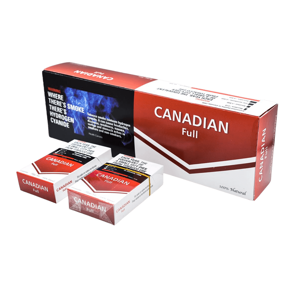
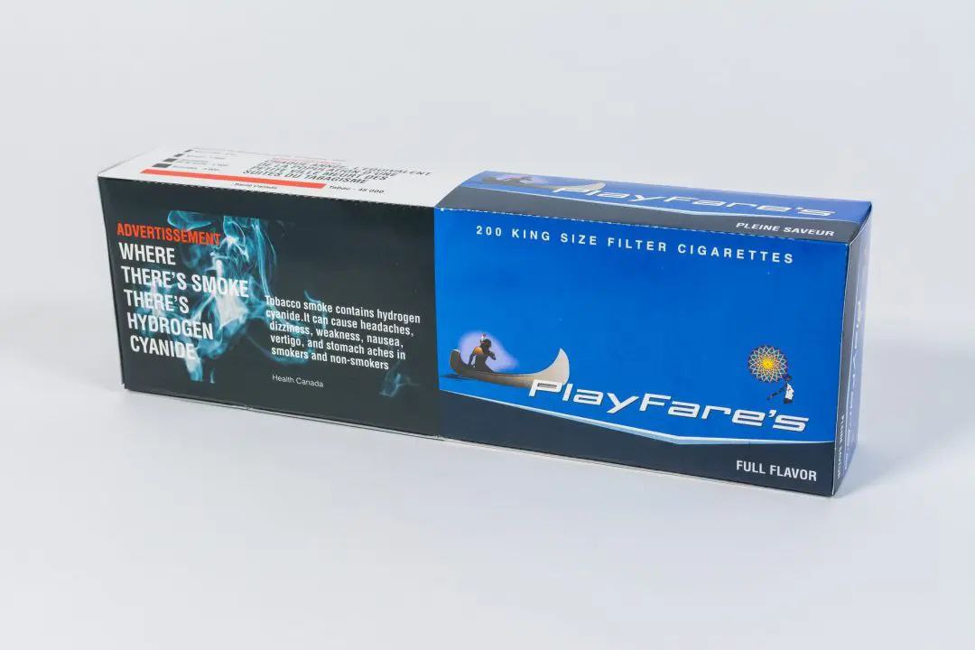
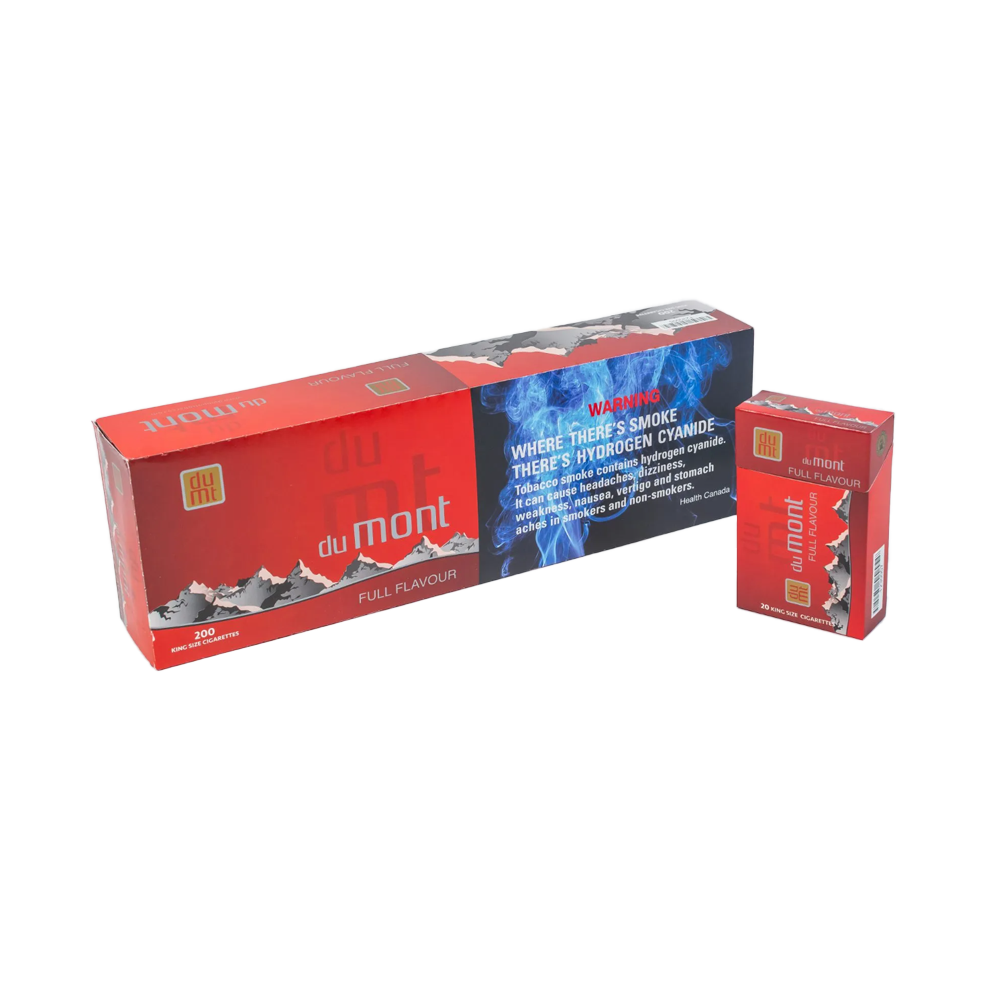
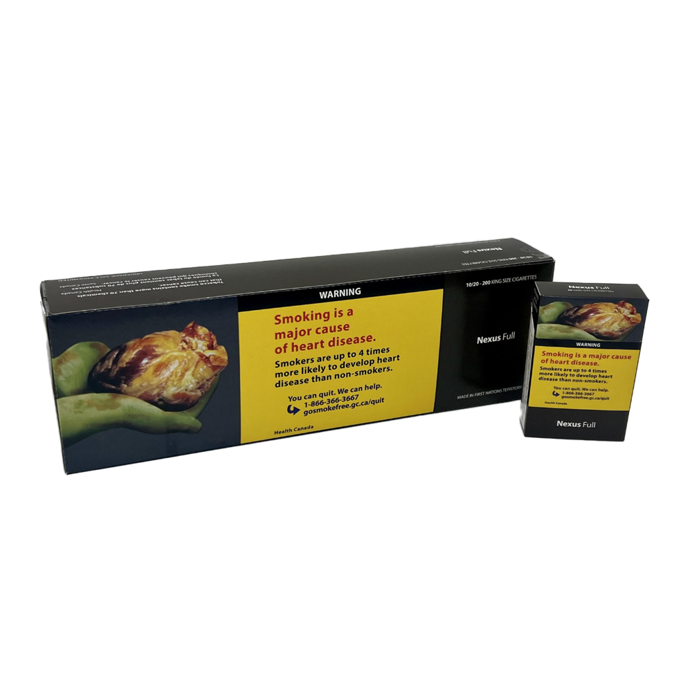
📦 Native Cigarettes: A Modern Alternative
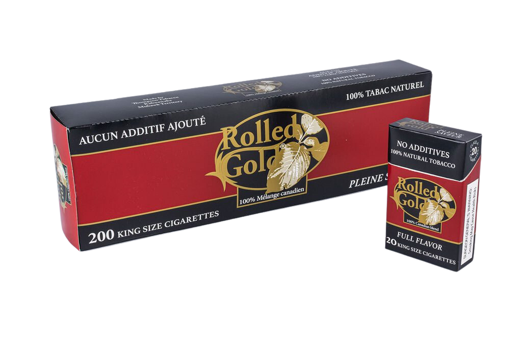
Today, Canadian smokers have more affordable options. Native cigarettes (Playfare, Canadian, DuMont, Nexus, Rolled Gold) cost $29-50 per carton — compared to $140-180 for commercial brands — a savings of 70-80%.
- 💰 Cost savings: A pack-a-day smoker saves $5,000-7,000 per year by switching to native cigarettes.
- 🚫 Not “healthier”: Native cigarettes contain the same nicotine, tar, and carcinogens as commercial brands. The only difference is price and packaging.
- 📦 Online delivery: Cigstore.ca ships to every province and territory with $29 flat shipping (free over $290).
🇨🇦 Resources for Smokers
- 📞 Smokers’ Helpline (1-877-513-5333): Free, confidential coaching.
- 💊 Nicotine replacement therapy (NRT): Patches, gum, lozenges — safe and effective.
- 📱 QuitNow (quitnow.ca): Free app with tracking and community support.
- 🩺 Your doctor: Medications like varenicline (Champix/Chantix) and bupropion (Zyban/Wellbutrin) can help.
🔥 Top 5 Native Cigarettes for Canadian Smokers
⭐ Excluded: BB light Manitoba, BB full Manitoba, Chanel Blueberry, Chanel ice. See all 29+ native brands at Cigstore.ca.
🚚 Delivery Across Canada – $29 Flat Rate
We ship to every province and territory using Canada Post, Purolator, FedEx, and UPS. Orders over $290 qualify for FREE shipping. Age verification (19+) required upon delivery.
📦 Same-day dispatch for orders before 2 PM EST. Tracking provided within 24 hours.
📚 You Might Also Enjoy These Articles
Cigarettes in 1920s Advertising
How tobacco companies first began using psychology to sell.
‘Hopelessness and Doubt’
The tobacco industry’s marketing strategy.
Most Famous Canadian Cigarette Slogans
From “More doctors smoke Camels” to plain packaging.
How Cigarettes Became Part of the Movie Detective’s Look
From Sam Spade to Philip Marlowe.
History of Smoking in Canada
From 1950s magazine ads to plain packaging today.